
 Qute is a collection of icons that dates back to the earliest days of Mozilla Firefox. It was born out of the desire to make the browser look more modern and better integrate with the system. The theme even shipped as the default for a while.
See my icons and themes page for downloads.
Style
The Qute icons are fairly bright and colorful, and sometimes a bit playful in their choice of symbols, although calling them “cute” may be an overstatement. Perspective is used quite liberally and they are in general rendered richly, but not realistically. I have, at least in recent iterations of the artwork, focused on keeping the visual complexity down despite this.
It may come as no surprise that the collection began largely as an imitation of the Windows XP icons. While the style is markedly different from current trends, I think it’s an aspect of the system that holds up fairly well.
History
Far from being one coherent icon set, Qute has historically been something of a junk drawer of various design ideas and techniques, changing and evolving along with my own skills.
Early beginning: Mozilla
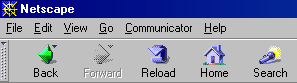
I started by replacing a few of the icons in Mozilla, (a “suite” of browser, email and other apps, also branded as Netscape 6 and 7). It used a look based on the old Netscape by default. Some of the elements originate from there: the green back icon and the blue looping arrow in the reload icon. At the time, even just the presence of anti-aliasing and full-color images without dither was enough to be a considerable improvement.
Later beginning: Phoenix
When Phoenix (later to be Firefox and replacing Mozilla) was released around summer/fall of 2002, it felt natural for me to continue the project for this new browser. The early days of Phoenix saw numerous versions released in quick succession, and this was the case for my theme as well. I fleshed it out to replace most images along with making tweaks to the CSS. And with me being one of the first to jump on Phoenix theming, my theme gained some popularity. It got its perhaps unfortunate name Qute during this time.
In retrospect, the quality of my artwork at the time was terrible. I might have included a screenshot here if it wasn’t that I’d rather keep it buried. As part of a general amateurishness, the icons suffered from being overdone. I felt that I hadn’t really done the job unless I used perspective, several gradients, overlaid symbols or sometimes even textures. The theme also had a very large size for toolbar icons (32 px for large and 24 for small). Because, well, drawing small icons was hard and I quite liked to see the result of my efforts large, anyway. Then again, I was a beginner.
Default theme in Firebird and Thunderbird
Soon after, the developers announced that Qute would be the default theme in the (newly renamed to) Firebird version 0.6. This was a great honor, though in retrospect my work wasn’t yet good enough to deserve as much exposure. On the other hand, the previous default and other themes at the time were mostly not great either, usually being more gimmicky and not aimed to be suitable as a default theme.
An update to the theme (that I think of as 1.1) released with Firebird 0.6.1 brought some improvements but wasn’t much better.
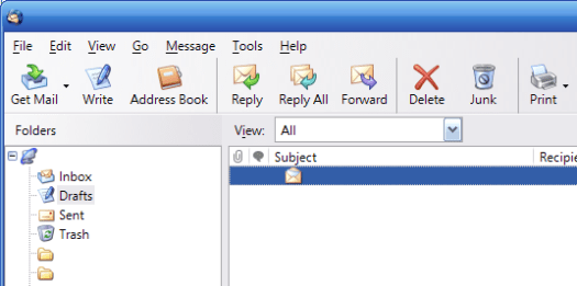
Around this time, I also had the opportunity to create the icons for the new email application Thunderbird. Initially, I thought of this as another instance of the Qute theme, and it looked similarly bad.
Version 2, remake
My next update, version 2, was a major overhaul that softened and refined the color palette and made perspective a bit more consistent. Although it still had many issues, I find this version a lot easier on the eye than its predecessors.

It didn’t have the chance to be included in a release of the browser soon to be named Firefox, because a new default theme took its place in 0.8. It was a change for the better for the browser but I was disappointed about being kept in the dark about it for a long time.
Version 3
Back as a separate theme, Qute 3 followed fairly soon after. It had several touch-ups, but the major change in it was the switch to a smaller, more typical icon size. This took care of the roughest edge remaining in the theme. Again, I now find plenty wrong with it, but it nevertheless had an unusual level of polish and care put into it. This helped the theme keep and grow something of a fanbase while it went without any major change for a couple of years.
I was still making the default theme in Thunderbird and it also got a corresponding update, which at least helped keep the application looking passable until I developed the new Kempelton theme for Thunderbird 2.0.
Version 4, remake again
The next version was perphaps the biggest change yet. Although it was fairly well liked overall, it also drew quite a bit of controversy and complaints. Why not release such a big change as a separate theme?
The changes in Qute 4 were never done just because I wanted it to be different. There were many things about the previous versions that were simply the result of bad decisions or a lack of skill. In some cases, an icon might have been okay on its own, but not consistent with the set as a whole. Qute 4 aimed to capture the essence of the theme and to remake it using my better experience.
As I laid out in my post, a remake was necessary. Without artwork created to accomodate new features, the theme would fade away. Since the last version, I had changed production software and improved my techniques. Adding new icons while keeping the old was out of the question due to inconsistency.
One of the changes I like best but also often complained about is the move from a star to a heart as the bookmarks icon (probably inspiring Twitter to do the same six years later).
