
 The oldest Firefox theme available has returned in a completely new version. I’m proud to announce Qute 4, available for Firefox 3.5.
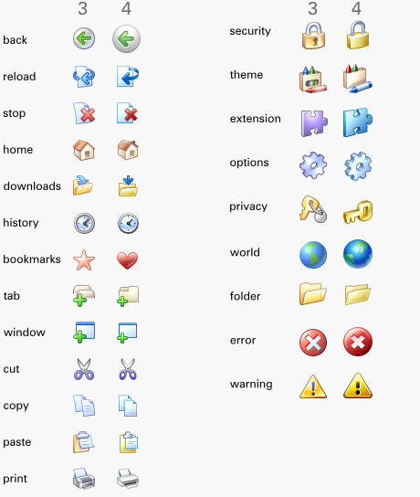
The icons in Qute 3.* date back to late 2004, shortly after the release of Firefox 1.0. It has remained fairly popular, but has increasingly lagged behind my skills as well as in completeness. To maintain the theme properly, the only option was doing everything from scratch. And here it is.
With this being a new version, I naturally tried to stay pretty close to the old icons. Still, to make the style consistent, and generally improve the quality, I felt some significant changes were necessary. The result is I think 4 is closer to the original “spirit” of Qute, not to mention just simply better. See for yourself in this comparison.
In addition, as with Kempelton, I’m making the Qute 4 SVG files available and allowed for use under license. Just get Inkscape, which is free and easy to use, and you can edit, convert to PNG or learn from them.

I use the updated Qute on FF3.5 linux. It conflict with personas for firefox. As personas background will not show with Qute as theme.
Hmm. It works for me on Windows. Could you test if “toolbox {-moz-appearance: toolbox !important}” in userChrome.css makes a difference? I doubt it though.
Yes it works.
i have used Qute theme for years … and i really liked it! But not the new one. I mean the new icons are very nice BUT the heart for bookmarks is so horrible! i always had to look at it while browsing, so I disabled the theme. please PLEASE please change it back to a star! thanx in advance 🙂
I agree! the symbol for bookmarks should be a star! With that heart it looks kinda childish.
Hello, the Qute theme is much better than the default Linux theme, thanks for having it published.
Just a little thing: with TabMixPlus (pre 4.7 version) I usually keep the New Tab button in the far left of the tab bar. When I check this option, the button becomes very small – see image.
This doesn’t happen with the default theme.
Thanks, bye. 🙂
@Simon: you can use the Tab Buttons extension as a temporary workaround for your problem till the Qute theme gets fixed.
I like the new style of Qute. It’s less cartoonish.
Maybe the people with the heart/star problem are right, I’m not exactly sure.
But there’s a thing that I want to share. While all buttons create the illusion of being pressed when clicked (the image moves down and right) the Back and Forward buttons only move down which is inconsistent with the other buttons. Not much of a bug but still…
Great work Arvid!
Looks good, though I much preferred the softer colours previous to version 4.
I’m finding that Qute 4 has a thin (1-3 px) white/grey horizontal line between the tab bar and bookmark bar when used alongside Personas. This isn’t an issue with the default theme, so it leads me to believe that the line is part of the Qute theme. Is there any way to remove the line or is this something that’s hard-wired into Qute? I haven’t tried this on other themes.
Sorry Arvid, but another vote for the softer look of previous versions. 😦
As many others I would prefer the older theme. It was kinda more uniform and complete, it needs no modernization IMHO. Would be great if you’ll made, say, a Qute Classic and remade this one in more individual theme with less looking back. Of course it’s only my good wish. Thank you for Qute, Arvid.
The new Qute is awful, I’m very sorry to say that but the previous version was really great. Could you please also post the old version but updated to FF 3.5??? Now I’m using Qute 3 but It’s not the same as original.
yeah, please make Qute Classic! or at least a version with star for the bookmarks
Please, bring back the star and the old style back and forward buttons!
Thank you for maintaining Qute over the years. So far, I prefer the previous version. It was the best theme out there and I think lots of folks felt the same way.
Bless you for your contributions. I hope you continue to provide your excellent product and work to the internet community.
Desertcat
Arvid, you are on the right track! At least in my opinion… 😉 Very good work – thank you!
The new incarnation of Qute is a step towards a more serious appearance and away from the comic-inspired look of earlier versions. If you got rid of the “bookmark heart” (it gives a slight “girlie” feeling…), it would be the icing on the cake.
And please don’t take all those “everything was better in the old days” opinions too serious. Everyone can change a theme to their likings. For example: Since I’m not too fond of the bookmark heart but do like the Tango icons very much, I combined some elements and created my private version of “QuteTango”. Best of both worlds… 😉 Have a look here:
Regards from Germany!
Ralph
P.S.: Thank you very much for publishing the svg sources of your graphics. That made it easy to create an icon for my “deviation” in under a minute. 🙂
I loathe the new asymmetric forward/back buttons. The star vs. heart thing I don’t care as much about although I don’t really like the look of the heart as-is (it’s kinda wide and ugly), so I’d be happier with the old star too. The old theme definitely did have softer colors, which was a huge difference in presentation, but I’m okay with the sharper look. My bigger problem is with subtleties like the home icon being a little too gray, the refresh/reload and stop icons too straight (no longer “qute”). In most respects the old icons are infinitely preferable, but I must admit I do like the new looks for the icons in alert boxes. But for me, I’d rather give up the new alert box icons and have the classic theme back, because the new theme fails in all the everyday ways.
And to those people who are saying the new Qute is more serious and less cartoonish and that’s somehow a good thing: Wouldn’t that sugest that the more serious look belongs in a brand new theme, and the old theme should be left in the style it had? The whole point of a theme is to establish a certain look; by departing from that look, Qute is no longer Qute, but something else entirely.
apart from the heart/star matter (I prefer star, as well), what I really miss in this new version is the background transparency (on windows at least).
In fact, I use a custom shell theme and now the background of menus and buttons is different from the window colour, thus looking ugly.
The new theme is great. Qute is still cute! 🙂 I really like the new forward/back buttons, too. I waited a long time for this change of style since the first version of Firefox 3. The only thing I don’t like is the heart.
@Ralph:
“Everyone can change a theme to their likings.”
How does that work? How can I edit the toolbar icons?
If someone is able to replace the heart by a star it would be very nice if he could upload the changed theme somewhere.
The tagline of Qute is “Simple and unobtrusive with clear, colorful icons”.
Yet in this iteration the colours are muted and the icons shiny rather than soft, making them look frankly horrible, and not at all the past “spirit” of the theme.
But the worst part is the rectangular back and forward buttons when using small icons. (I dislike the heart too, but that’s the least of this version’s problems).
Don’t “fix” what isn’t broken is a good saying, but you seem to have ignored that here, and turned Qute into Kempleton Lite. After sticking with this theme since Firefox 0.6 it looks like I’ll have to find or make a custom version. Very disappointing.
Thanks for your work!! I liked the old style better tough. I hope you can make a version with the old style available, or at least older versions available. I had to downgrade to FF 3.0.11 and now I’m qute less because there’s no old version and the new one is not compatible 😦
Thank you, axelsson! Qute was my favorite theme.
I think the new version (4.x) is not as good as the old version (3.x).
Just post here to say goodbye to it.
Maybe I will back. 🙂
Thank you again.
Arvid, well done on Qute 4 theme. Qute 4 is fine as it
is,very much improved over the previous version. Thanks.
Was curious if Qute will eventually be available for Firefox 3.5 on Macs?
Amy R: Unfortunately that is not likely anytime soon.
Cool! Glad someone saw Steve’s comments. It’s a great newsletter to subscribe to. Thanks for the themes Arvid!
Thank’s about this feature software.
I really dislike this new theme. The older classic was MUCH better. I have found the classic one that somebody else put up and am using that now.
I have been using Cute since FireFox 1.0 and always liked it a lot. The new version 4 not so much. Could you make a FireFox version of the Cute 3.x icons? Reading above you would make a lot of people happy if you did …
First: Great work, great job…
I run Firefox 3.5.3 using Qute 4.0.1 on Windows XP % Windows XP x64.
On x64, the icons match those shown on https://arvidaxelsson.se/blog/wp-content/uploads/2009/05/comparison.png
On the 32bit XP, the Back & Forward icons are different.
Not really a problem, just curious?
KeepItSimpleEngineer: If you enable text labels the icons are different and obviously if you enable small icons too. Otherwise show a screenshot, please.
BINGO< & thanks again!
It is hard to read the words in white on a transparent background.
Dark text (gray) on clear background (without transparency) would be great.
I speak only of tabs and menu, of course!
I agree for favorites, star is better.
Otherwise, it’s great ! It’s the best one !
Thanks
Thanks for the theme, I really like it! I prefer the heart over the star.
I have an issue to report, which I think is a bug but may be intentional: the toolbar menu buttons look like a button nested inside a button. This takes a lot of extra horizontal and vertical space. Here’s a proposed fix, which applies to global/toolbarbutton.css in chrome.jar:
— global/toolbarbutton.css 2009-11-23 21:49:30.955221913 -0500
global/toolbarbutton.css 2009-11-23 21:54:22.115217863 -0500
@@ -119,6 119,7 @@
toolbarbutton[type=”menu-button”][disabled=”true”],
toolbarbutton[type=”menu-button”][disabled=”true”]:hover,
toolbarbutton[type=”menu-button”][disabled=”true”]:hover:active {
-moz-appearance: dualbutton;
border-style: none;
padding: 0 !important;
}
Bummer, the patch didn’t make it through intact. The patch adds the following line to the rule starting at line 115 of global/toolbarbutton.css:
-moz-appearance: dualbutton;
Hi
Any chance of update for FF 3.6?
Thanks,
Vel
Yes, coming soon.